Creating a user interface is never a simple task, but Chakra UI is a great UI library to get your Next.js application up and running fast, all while maintaining aesthetics. In this guide, you'll learn how to set up a simple Next.js app with Chakra UI.
Presequisites
- ✅ Standard knowledge of Next.js setup and usage 🧰
- ✅ Some experience with UI/UX Design 🧑🎨
Create a NextJS Project
You can create a blank Next.js project by running:
npx create-next-app my-project
# or
yarn create next-app my-project
Create a Next JS Project Using Typescript
Alternatively, Next.js provides integrated TypeScript support. You can create a TypeScript project with create-next-app using the --ts, --typescript flag as shown below:
npx create-next-app@latest --ts
# or
yarn create next-app --typescript
🚨 Please note that when adding Chakra UI to a TypeScript project, a minimum TypeScript version of 4.1.0 is required.
Once all installations are successful and complete, you're ready to start coding in TypeScript!
🚨 A file named next-env.d.ts will be created in the root of your project. This file ensures Next.js types are picked up by the TypeScript compiler. You cannot remove it or edit it as it can change at any time.
Learn more about using Typescript in their Next JS Docs.
Adding Chakra UI to your Next.js Application
To get started using Chakra UI, install the core Chakra UI package by running:
npm i @chakra-ui/react @emotion/react@^11 @emotion/styled@^11 framer-motion@^4
# or
yarn add @chakra-ui/react @emotion/react@^11 @emotion/styled@^11 framer-motion@^4
After installation, you'll need to add Chakra providers.
Adding in Chakra Providers
Chakra uses the ChakraProvider component, which then wraps your website with a context containing properties such as the Chakra theme, color mode functionality, CSS reset, global styles, and more.
In ./pages/_app.js:
import { ChakraProvider } from '@chakra-ui/react';

const MyApp = ({ Component, pageProps }) => {
  return (
    <ChakraProvider>
      <Component {...pageProps} />
    </ChakraProvider>
  );
}

export default MyApp;
If you are using Typescript, use the ChakraProvider component in ./pages/_app.tsx and replace by the following code:
import type { AppProps } from 'next/app';
import { ChakraProvider } from '@chakra-ui/react';
const MyApp = ({ Component, pageProps }: AppProps) => {
return (
<ChakraProvider>
<Component {...pageProps} />
</ChakraProvider>
);
}
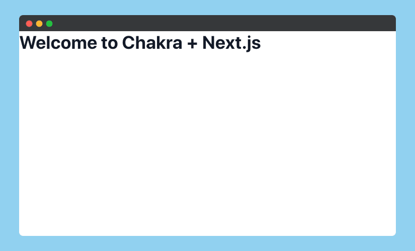
export default MyApp;In your ./pages/index.jsx or ./pages/index.tsx, add the following code:
import { Heading } from '@chakra-ui/react';

const Home = () => {
  return (
    <Heading>Welcome to Chakra + Next.js</Heading>
  );
}

export default Home;
If everything was imported successfully, once the component rerenders you should be greeted with your newly written heading.
Hero component
Now that you're getting the hang of it, let's create a simple hero component! First, create a ./components/Hero.js or ./components/Hero.tsx file. And inside try out the following example code:
import { Container, Stack, Flex, Box, Heading, Text, Image, useColorModeValue } from "@chakra-ui/react";

import Blob from './Blob';

const Hero = () => {
  return (
    <Container maxW={'7xl'}>
      <Stack
        align={'center'}
        spacing={ { base: 8, md: 10 } }
        py={ { base: 20, md: 28 } }
        direction={ { base: 'column', md: 'row' } }>
        <Stack flex={1} spacing={ { base: 5, md: 10 } }>
          <Heading
            lineHeight={1.1}
            fontWeight={600}
            fontSize={ { base: '3xl', sm: '4xl', lg: '6xl' } }>
            <Text
              as={'span'}
              position={'relative'}
              _after={ {
                content: "''",
                width: 'full',
                height: '20%',
                position: 'absolute',
                bottom: 1,
                left: 0,
                bg: 'cyan.400',
                zIndex: -1,
              } }>
              Example Application
            </Text>
            <br />
            <Text as={'span'} color={'cyan.400'}>
              Next.js + Chakra UI
            </Text>
          </Heading>
        </Stack>
        <Flex
          flex={1}
          justify={'center'}
          align={'center'}
          position={'relative'}
          w={'full'}>
          <Blob
            w={'150%'}
            h={'150%'}
            position={'absolute'}
            top={'-20%'}
            left={0}
            zIndex={-1}
            color={useColorModeValue('cyan.50', 'cyan.400')}
          />
          <Box
            position={'relative'}
            height={'300px'}
            rounded={'2xl'}
            boxShadow={'2xl'}
            width={'full'}
            overflow={'hidden'}>
            <Image
              alt={'Hero Image'}
              fit={'cover'}
              align={'center'}
              w={'100%'}
              h={'100%'}
              src={
                'https://cdn.pixabay.com/photo/2016/04/15/04/02/water-1330252_960_720.jpg'
              }
            />
          </Box>
        </Flex>
      </Stack>
    </Container>
  );
}

export default Hero;
You may be wondering when the heck did we make a blob? Well, we're going to do it right now! Create a ./components/Blob.jsx (find the TypeScript below) file with the following code:
import { Icon, IconProps } from "@chakra-ui/react";

const Blob = (props: IconProps) => {
  return (
    <Icon
      width={'100%'}
      viewBox="0 0 578 440"
      fill="none"
      xmlns="http://www.w3.org/2000/svg"
      {...props}
    >
      <path
        fillRule="evenodd"
        clipRule="evenodd"
        d="M239.184 439.443c-55.13-5.419-110.241-21.365-151.074-58.767C42.307 338.722-7.478 282.729.938 221.217c8.433-61.644 78.896-91.048 126.871-130.712 34.337-28.388 70.198-51.348 112.004-66.78C282.34 8.024 325.382-3.369 370.518.904c54.019 5.115 112.774 10.886 150.881 49.482 39.916 40.427 49.421 100.753 53.385 157.402 4.13 59.015 11.255 128.44-30.444 170.44-41.383 41.683-111.6 19.106-169.213 30.663-46.68 9.364-88.56 35.21-135.943 30.551z"
        fill="currentColor"
      />
    </Icon>
  );
};

export default Blob;
For TypeScript version, create a ./components/Blob.tsx file:
import { Icon } from "@chakra-ui/react";

const Blob = (props) => {
  return (
    <Icon
      width={'100%'}
      viewBox="0 0 578 440"
      fill="none"
      xmlns="http://www.w3.org/2000/svg"
      {...props}
    >
      <path
        fillRule="evenodd"
        clipRule="evenodd"
        d="M239.184 439.443c-55.13-5.419-110.241-21.365-151.074-58.767C42.307 338.722-7.478 282.729.938 221.217c8.433-61.644 78.896-91.048 126.871-130.712 34.337-28.388 70.198-51.348 112.004-66.78C282.34 8.024 325.382-3.369 370.518.904c54.019 5.115 112.774 10.886 150.881 49.482 39.916 40.427 49.421 100.753 53.385 157.402 4.13 59.015 11.255 128.44-30.444 170.44-41.383 41.683-111.6 19.106-169.213 30.663-46.68 9.364-88.56 35.21-135.943 30.551z"
        fill="currentColor"
      />
    </Icon>
  );
};

export default Blob;
Once you've created your hero and blob component, import Hero.tsx into your ./pages/index.js or ./pages/index.tsx file like so:
import Hero from '../components/Hero';

const Home = () => {
  return (
    <Hero />
  );
}

export default Home;
Once your application re-renders, your landing page should resemble the following:

Congratulations!🎉 You can now create awesome user interfaces, time to get your Chakra on! 🕉️
If you want to go further and build a landing page for your project, check out our complete Next js templates with navigation bar, pricing card, testimonials, call to action and much more. For developers who want to build their own SaaS product, this article about React SaaS Boilerplate can help you in your journey.